- Home
- BOOKS
-
The Collectorate
- Earth
- Tamarind
- Hiebimini
- Brahma
- Catalan
- Indonesia Prime
- Moroccan Prime
- Zwahili Kingdom
- New Ecuador
- Xavier's Garden
- Bolivar
- Brasilia Major
- Everdeen
- G'hladi
- Hokkaido
- Maia
- Mariabella
- New Caledonia
- New Riyadh
- Pinochet
- Cairnes
- Inuit Kingdom
- Boer
- Marshall's Haven
- Euphrates
- Andean
- New Manila
- Forster's Alliance
- Kyriokos
- Marianas
- Qasi Ransome
- New Bangkok
- Encilladi
- Azteca
- Yaniff
- Hansen's Landing
- Mauritania
- Narland
- Pitcairn
- Kartuffe
- About
|
Most writers I know (especially those of the indie variety) will agree that the most aggravating part of this whole gig is post-production. Of course, there's the endless revision and editing. You know, the one where you surgically polish the text so often that by the time you're finished, most of your excitement about the story has waned (like drinking Coke without the carbonation). But I find that cover design is the real nail-biter in the process.
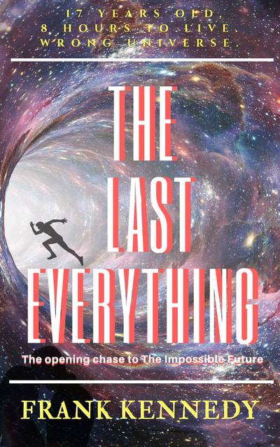
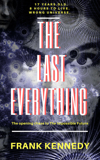
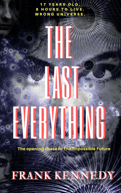
I've been narrowing down the final design for The Last Everything, which will publish this month, and it has been a bear. For indie novelists working to build an audience, cover design is pivotal to help us find visibility amid the literary clutter (the millions of titles on Amazon grow daily). Yet it's hardly the only factor (decent writing, a hoot of a story, and a great online blurb are somewhat helpful). For this novel, I ran these designs past multiple closed groups of writers online as well as seeking out Facebook friends, who would tend to examine books as consumers and not as marketers. Take a gander at these three. I could go with any of them, but ultimately decided the second option fits the book thematically, peers back at the reader's soul with those piercing eyes, and ... drumroll, please ... it contains rules above and below the title to add focus to the center. It's subtle, of course. About three-fourths of commenters preferred this one. Thus, the tyranny of the majority has won! Yee-haw. Now, time to finish the publishing process and start writing its sequel. A four-book series demands I cannot leave my vast army (???) of readers in the lurch for long. Comments are closed.
|
Categories |
Proudly powered by Weebly


 RSS Feed